Reading Time: 2 minutes
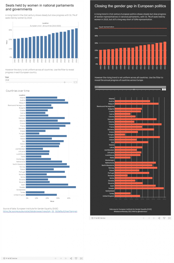
This week’s dataset was from European Institute for Gender Equality and shows the proportion of seats held by women in European parliaments and governments. Another great dataviz learning experience and on the whole I’m OK with the finished product this week, I know I still have a big journey ahead of me to create some decent work, but it feels like a big improvement and tangible progress on my previous effort. I used the timeline slider for the first time and explored Tableau’s formatting tools in more depth. I also applied some learnings from last time by going straight for portrait mode, using a decent font size, avoiding cognitive overload and keeping the screen elements to a minimum, leading with the key finding and then fleshing out the detail further down.
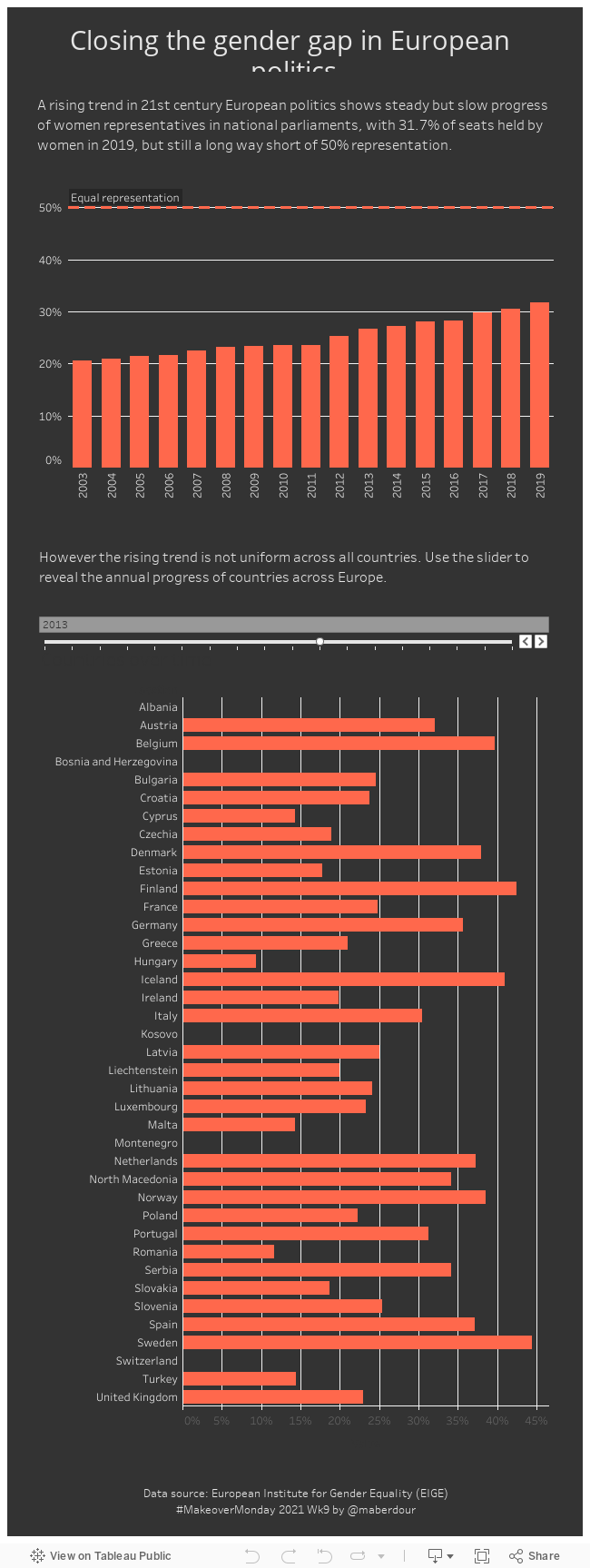
The viz embedded below is interactive so you can rollover with the cursor to explore the values and use the timeline slider.
The below image shows my before and after attempts. This week I was strict about timeboxing my first attempt at 90 minutes. I’m thought it was pretty rubbish to look at, but at the same time did an okay job of showing the improving overall improving trend across Europe and then breaking that down into the stories for individual countries using the timeline slider, a feature that was new to me and took some time to get to grips with. Unfortunately it was three weeks since my last attempt due to work and family pressures and I had completely forgotten how to use many of the Tableau functions I ‘learned’ last month. It’s clearly one of those tools that you need to use regularly else you’ll forget the basics quickly.
The revision was done after watching the viz reviews on Wednesday evening. It’s not much of a change functionally but the all-important title is a bit snappier and I think the colours are lot more appealing. Tableau is pretty annoying for formatting as unless I am missing something, you have to change formats in so many different, individual elements to get the effect you want. But I think the colours make a massive difference, it makes the viz instantly more appealing and it seems to draws you in. Some useful feedback from the review session was to include the 50% line to show where equal representation lies, which brings home that the story here is not about the improving trend, it is about the gender gap still being very wide. I also sorted out the page footer a bit, ending up with something I’m fairly pleased with.